Excel Charting Elements
|
|
|
|
|
|
|
|
|
|
|
|
|
|
Excel Charting Elements
Additional Resources
Excel Charting Elements
Excel Charting Elements
Excel Charting Elements | Microsoft Excel XP | Page 4 |
 |
Working With Chart Legends
If you created your chart with the Chart Wizard, you had an option to include a legend as part of the Excel charting elements. If you change your mind, you can easily delete the legend or add one if you need one.If you didn't include legend text when you originally selected the cells to create the chart, Excel displays Series 1, Series 2, and so on in the legend.
To add series names, follow these steps:
| 1. | Activate the chart. |
| 2. | Choose Chart ► Source Data from the menu bar. |
| 3. | In the Source Data dialog box, click the Series tab. |
| 4. | Select a series in the Series box and then enter a
name in the Name box. For the name, you can use text or a reference to a cell that contains the series name. |
| 5. | Repeat Step 4 for each series that you want to name. |
| 6. | Click OK and the new names appear in the legend. |
Changing A Charts Scale
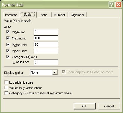
In Excel charting elements, adjusting the scale of a value axis can have a dramatic effect on the appearance of the chart. Excel always determines the scale for your charts automatically.You can, however, override the choice Excel makes:
| 1. | Activate the chart. |
| 2. | Select the value (Y) axis. |
| 3. | Choose Format ► Selected Axis from the menu bar. OR Double-click the axis. |
| 4. | In the Format Axis dialog box, click the Scale tab. |
 |
|
| The dialog box varies slightly depending on which axis is
selected. The Scale tab of the Format Axis dialog box offers the following options: |
|
| ► MINIMUM Lets you enter a minimum value for the axis. If checked, Excel determines this value automatically. ► MAXIMUM Lets you enter a maximum value for the axis. If checked, Excel determines this value automatically. ► MAJOR UNIT Lets you enter the number of unit between major tick marks. If checked, Excel determines this value automatically. ► MINOR UNIT Lets you enter the number of unit between minor tick marks. If checked, Excel determines this value automatically. ► CATEGORY (X) AXIS CROSSES AT Lets you position the axes at a different location. By default, the axes are positioned at the edge of the plot area. The exact wording of this option varies, depending on which axis you select. ► DISPLAY UNITS Lets you set the display units for large numbers on the axis. Using this option can make numbers displayed on the axis shorter and more readable. ► SHOW DISPLAY UNITS LABEL ON CHART Lets you add a label on the axis that describes the units selected in the Display Units drop-down box. ► LOGARITHMIC SCALE Lets you use a logarithmic scale for the axes. Useful for scientific applications in which the values to be plotted have an extremely large range; a log scale gives you an error message if the scale includes 0 or negative values. ► VALUES IN REVERSE ORDER Makes the scale values extend in the opposite direction. ► CATEGORY (X) AXIS CROSSES AT MAXIMUM VALUE Lets you position the axes at the maximum value of the perpendicular axis (normally, the axis is positioned at the minimum value). The exact wording varies, depending on which axis you select. |
|
| 5. | Make the changes and then click OK. |
Excel XP Topics
- Tips- Excel Screen Layout
- Navigational Techniques
- Working with Workbooks
- Templates
- Working with Worksheets
- Moving Around
- Move Worksheets
- Copy Worksheets
- Insert & Delete Cells
- Insert & Delete Rows
- Insert & Delete Columns
- Resize Row
- Resize Column
- Editing Data
- Content Color
- Cell Color
- Number Formats
- Fonts
- Alignment
- Text Direction
- Indent Contents
- Merge Cells
- Copy
- Move
- Undo & Redo
- Using Zoom
- Freeze & Unfreeze Titles
- Split Worksheet
- Spreadsheet Data
- AutoFill
- AutoComplete
- Comment
- Find
- Replace
- Spellcheck
- Formulas
- Functions
- Password
- Sorting
- AutoFilter
- Advanced Filter
- Macros
- Charts
- Charting
- Charting Elements
- Gantt Chart
- PivotTable
- PivotTable Calculations
- PivotTable Layout
- PivotTable Format
- PDF to Excel
- PDF-to-Excel Converter
- Excel to PDF Converter
